A history of the London Underground’s graphic design including Frank Pick’s design direction, Edward Johnston’s typography & Harry Beck’s Tube Map
The following is an essay I wrote about the London Underground’s graphic design history back in university. Though the essay dates back to 2007, it’s obviously still relevant as it covers the Tube’s history through graphic design.
This year marks the 150th anniversary of the London Tube’s first underground railway. To celebrate, I’m making the following essay available as a downloadable image which can be folded into a small booklet in the same style as the revolutionary Tube map. Click here to view the downloadable version.
* * *
London’s Underground system of the 20th century marked a new era for both city planning & transportation as well as contemporary design & aesthetics. With Frank Pick’s revolutionary changes to the transport system and Harry Beck’s map design, the Underground continually was at the forefront of modern, contemporary graphic design.
The Underground’s designers of the early 20th century did more than add pretty posters and simplify the system; they revolutionized urban design in a practical way with functional purposes. The Underground — the world’s first underground electric railway system — opened in 1890.
Frank Pick (1878-1941) provided guidance and inspiration during the Underground’s early history which put the London Transport system ahead of many in new marketing and graphic design.
Under Frank Pick’s direction as Chief Executive of London Transport, a new logo and typeface was commissioned. From these new designs came a necessity for a new map — one that changed the style of transport maps across the globe. Self-marketing became as prominent and important as advertising did, and the Underground system as a whole redefined public transportation and recreated the industry as a viable choice for innovative graphic design.
Frank Pick – Creator of the London Underground Design
Frank Pick, as Chief Executive of London Transport between 1913 and 1938, commissioned the famous font and logo for the Underground brand. He began his long career at London Transport as a statistician and attorney.
His criticisms of the Underground’s promotional efforts eventually led to publicity being added to his responsibilities. This led to immediate changes in the advertising efforts at stations and on platforms (see Posters).
By the end of Frank Pick’s career at the Underground, he had helped manage and oversee new designs in station signage, station architecture, product design and even train and bus design. Interior designs for station platforms and the buses were carefully and strategically developed to allow for maximum comfort and industrial aesthetic.
Pick’s design patronage throughout his career enabled the Underground to become a solid and undeniable leader in transportation design. The Underground “became an international model for corporate design responsibility” according to Megg’s History of Graphic Design.
Advertising on the Underground: Historic Posters
Frank Pick, though lacking any artistic training, had a strong sense of design and a passion for art. When he became in charge of publicity at London Transport in 1908, he created space for transportation information and publicity at station entrances.
In addition to designating specific poster boards for promotional efforts by the Underground system, he also cleared space for Tube posters and maps and pushed advertisers’ posters into grid-like spaces inside stations and on platforms. By reducing the clutter at station entrances and providing specific spaces for promotional posters, Pick single-handedly created the Underground as a leader in graphic design.
Innovative as well as emerging artists were called in to create promotional posters encouraging Londoners to travel on the Underground, but also to use the system for specific reasons. Posters in the 1920s advertised new stations and what could be found there in attempts to drive traffic to new places for new reasons in off-peak and weekend travel times.
Pick’s influences on poster design in the Underground established a showcase of the many different emerging art styles of the 20th century. In the 1930s, Pick went so far as to organize public exhibitions of art and graphic design in the Charing Cross Underground station ticket hall. Famous artists featured throughout Pick’s patronage included Austin Cooper, Edward McKnight-Kauffer (who produced the first Cubist poster), Man Ray, Hans Schleger and countless others.
Edward Johnston’s Typeface
The test of the goodness of a thing is its fitness for use. If it fails on this first test, no amount of ornamentation or finish will make it any better; it will only make it more expensive, more foolish. — Frank Pick
Pick thus commissioned Edward Johnston to create an exclusive, patented typeface in 1916. Pick’s guidelines for Johnston were for a bold but simple and distinctive lettering using historical typography as a model; though the new typeface needed to be indisputably 20th century design.
Johnson’s sans-serif typeface created among these apparent contradictions features strokes of equal weight, classical proportions (based on Roman inscriptions) and a reductive design of simple elegance.
His elementary and timeless design features an M which is a perfect square of 45-degree diagonal strokes and an O that is a perfect circle. Johnston has been called the father of the modern revival of lettering. His style helped revive calligraphy and influenced his pupil Eric Gill — the typeface designer renowned for Gill Sans.
Johnston’s typeface for the Underground is considered to be the first modern sans serif face, a precursor for the rest of the 20th century which was heavily reliant upon modern and post-modern design.
Harry Beck’s Map – an icon of London Underground design
Harry Beck (1903-1974) was a draughtsman working for the Underground. Inspired by electrical circuit diagrams, he developed a schematic map for the Underground transport system making it easier to read and distinguish between the numerous lines and stations.
His design was an immediate and instant success and has become an iconic design symbol for the city of London. On a BBC Culture Show in 2006, Beck’s design was voted second to the Concorde as the “public’s favourite design icons.”
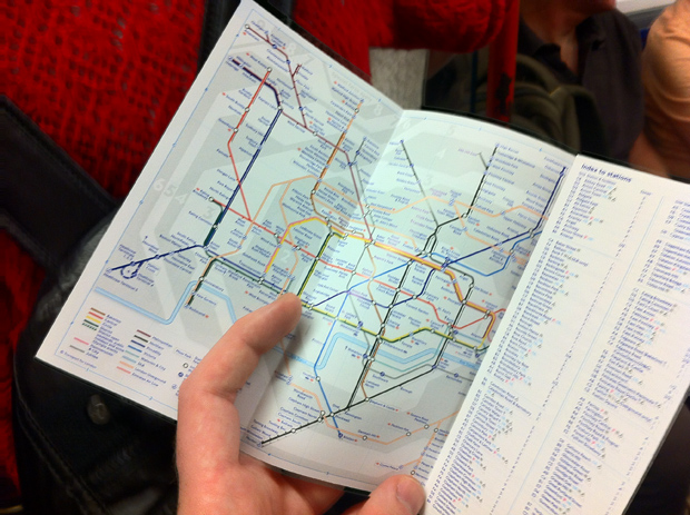
The Tube Map
The first public transport maps of London were developed and produced by the Metropolitan District Railways showing where travelers could change lines and connect with other transport systems. These maps were geographic, showing Underground lines and stations in relationship to street plans above ground.
In 1931, Harry Beck attempted to solve the problems of earlier geographic maps (because of their geographical nature, it was hard to decipher more central locations on a sprawling, large-scale map). Instead of relying on a street plan, Beck compressed the outlying areas where there were fewer stations and expanded the central London area where many stations were crowded together on the older maps.
Using horizontal, vertical and 45-degree diagonals, Beck simplified and color-coded the transport system in a distinctive and recognizable way. Stations were marked as dots and interchanges as diamonds or full circles.
Beck’s initial map was rejected on the grounds that it was too radical, but after making various modifications, the map was published in 1933 as a pocket-map trial version. It was an instant success and has survived hundreds of revisions over the past 80 years. Today’s modern design is still largely reliant upon Beck’s 1933 version.

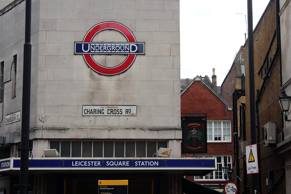
The Underground Logo
Commissioned by Frank Pick during his years as Chief Executive of the London Transport system, the logo has come to be a symbol of not just the Underground, but London itself. The logo was commissioned at a similar time as the entire redesign of the Underground. The font choice for the logo was one of the most important decisions for the redesign.
Pick wanted the sign representing the Underground (referred to as the roundel) to be inconspicuous but recognizable. Londoners are exposed to thousands of distractions throughout a single day, and the Underground’s logo needed to stand out among the clutter, but not be intrusive because of its constant prominence in Londoners’ lives.
When Pick commissioned Edward Johnston to design and create a new typeface, the idea was to change the entire branding of the Underground, so Johnston redid the roundel logo as well.
His new version of the Tube’s logo used his new typeface (Johnston’s Railway Type) on a single blue bar in front of a red-outlined circle. The older logo had been a solid red circle (designed by Frank Pick), but Johnston’s new design in the early 20th century (and still used today with some refinements made in 1972) matched well with the reductive design of the typography featured on all Underground station signage.
The Underground logo has become a major part of London’s history and is also a major commercial symbol featured on an unlimited number of commercial products.
* * *
Download a copy of this graphic design history of the London Underground as a printable brochure.
How cool is this? I am so impressed, reading the history. Thank you!
Thanks. History is important and design history is often overlooked. So many important decisions went into the design of the London Underground that people probably aren’t even aware of!
This is awesome…thanks for the history lesson!
I love this! So much history I didn’t know. I remember my first time in the London tubes as a teen. Your downloadable foldable is just cool!
Thanks Jen.
Love this post Adam. I recently found out that Frank Pick was born and lived in the same town as I grew up in – the history of the Tube really is fascinating sometimes!
That’s awesome to hear Charley! I didn’t even realize most people were aware of Frank Pick.
A lovely history. Sounds like anyone who sets foot in the London Underground owes a huge debt of gratitude to Frank Pick. Edward Johnston’s typeface was genius — but Pick commissioned it.
Yep, Pick seemed to have a lot of influence over the London Underground’s overall design AND marketing. I think there were a lot of clever people involved throughout it’s development and design.
that was very interesting, thanks for sharing Adam
Oh you font nerd ;P
Yes indeed! Typography is so important, though, and most people don’t even realize how and why certain fonts are created & used!
Oh, how interesting! Thanks for a great read…
What a great history. I was just in Boston which has the first US metro system and it’s truly amazing if you think about all the work that goes into getting it moving and working, and also designing it.
I love the Tube in London, It’s one of the easiest and most accessible one I’ve ever seen and I’ve lived in NYC.
Fascinating. My kids and I have traveling within London via the Underground tons of times now, but we’ve never seen it as anything but utilitarian at those times. It’s so interesting to think that, of course, a lot of thought and detail went into its design.
What a great resource! I tend to avoid the tube because of the cost, but it all sounds fascinating! Sure beats Seville’s one metro line (which was opened in 2009!)
Fascinating. Thanks for providing great insight into London’s Underground Tube.
Wow- this gives me a brand new way of looking at the London Tube! Thanks for sharing!
Thanks Adam for giving us the important background of London Underground Tube. I’ve been to Singapore and I’m fascinated by their MRT/LRTtrain system. Now I’m here in New York City taking the Subway everyday. Here I’m more amazed by the complexity of the Subway. After reading your post, however, I’m reminded that the London Underground Tube is the mother of all the train systems.
[…] left or to the right. Like a beacon alerting you to save that cab fare, the tube’s iconic rondel design is visible from several blocks away. 2. The London Underground’s stations and lines are […]